Improving download behaviors in web browsers
Saving the world,
one file at a time
The confusing & inconsistent state of downloading files using a web browser has long been a pet peeve of mine. The current situation is pretty much a mess in every web browser. Issues with file systems in general notwithstanding, even doing simple downloads to a centrally defined folder can be confusing, even frustrating.
The aim of this article is to give an introduction to how the most common browsers behave when it comes to downloading files, what opportunities exist, and close with a set of recommendations for how to fix this in Firefox and other browsers. It is my hope that putting these ideas out there will spur some innovation in this area both in Firefox and competing browsers.
We’ll try to cover the most obvious issues in the most common browsers, so we can all get better at this. This article will cover:
- Firefox 3.6,
- Internet Explorer 8,
- Chrome 5 beta,
- & Opera 10.50 beta.
Beverage warning
Every once in a while, I publish articles that may require some time commitment, because I think the subject matter warrants an in-depth treatment, and because that’s how I roll. As per Blaise Pascal, “Je n’ai fait celle-ci plus longue que parce que je n’ai pas eu le loisir de la faire plus courte” — I would have written a shorter letter, but I did not have the time.
So find a beverage of a suitable size and persuasion — this stuff can certainly drive UI designers to go for the hard liquor — and let’s look at the current landscape for browser download handling, and how it can be improved.
Existing approaches
It’s useful to have a basic understanding of how downloads are handled in the various browsers:
Firefox
Let’s start with Firefox:
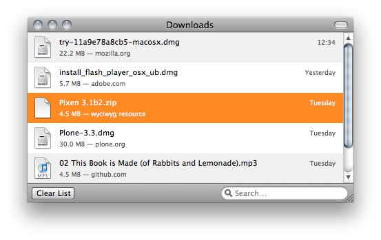
In addition to the download window itself, there’s also a download progress indicator in the status bar, that — when clicked — will bring up the download manager window: 
There’s a lot to like about the current download manager in Firefox:
- It tells you the size of the file, the domain you got it from, and when you downloaded it.
- It has a built-in filter labeled “Search…” — which is slightly misleading — but it works well for locating files that you have already downloaded.
- The status bar download indicator tells you how much time is left, and provides an easy (although not necessarily very discoverable) way to bring up the download manager window.
…but there are also elements that are problematic:
- It’s a dedicated window, which easily gets lost if you’re not careful — it will be hidden under the browser window or other windows you activate. This is especially noticable in OSes that are more app-centric than window-centric — prominent examples are Mac OS X, and now Windows Vista/7.
- It has a lot of “administrative debris” — my pet peeves are:
- The window doesn’t automatically resize to fit the downloads shown,
- Certain personality types (present party included) will obsessively click the “Clear List” button to clean up the list once they are done. Of course, this doesn’t actually remove the history entries of these sites, but more about that later.
- There are still some valid cases here, some people never clear their downloads, and use the search filter to find files they downloaded a long time ago, for instance. This is a use case we should still support.
- When the downloads are done, the download indicator in the status bar disappears. Yes, read that again. It disappears. This is crazy. Just when you need it to activate the downloads window — gone.
Internet Explorer
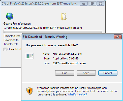
Moving on to everyone’s favorite browser, the approach is pretty simple, no dedicated download manager, everything is handled by dialog windows:
The good:
- There’s a you-can’t-miss-it dialog when saving, it shows you a dialog box every time you do a download. This is crude, but effective — it works well, especially with novice users.
- Asking where to put the file every time minimizes confusion about where it went to some extent — of course, after a while, this turns into a classic “Whatever” dialog, and the users lose track of it anyway.
- The progress bar shown in the application icon while a download is in progress is nifty:
 — this shows that the download is 50% complete. I believe we are in the process of landing something similar on Windows Vista/7 in the nightly Windows builds of Firefox too.
The bad:
- Every download opens a separate window, which becomes unmaintainable when you do a lot of downloads, and also leads to a lot of stray windows unless you manually clean them up.
- There’s no way to search in downloads.
- Seeing a dialog box for every single download gets annoying after a while.
- The download window can still get lost, this is magnified with the Vista/7 approach where the windows live inside the icon of the application. Especially frustrating: it will throw up a dialog box that you may miss if you click somewhere else at that exact moment, which results in the download never starting if it was an exe, since it blocks the download until the question has been answered.
- It also seems to ask multiple times whether you really want to download/run the file (once when initiating download, once when running it? There’s some slightly inconsistent behavior here that we haven’t quite been able to figure out the logic behind)
Safari
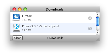
Nothing revolutionary, overwhelmingly similar to the Firefox approach, with a few improvements and a few missing features. It has the same dedicated “download manager” window approach:
The good:
- Minimalist presentation.
- Easy way to reveal the location on the file system where the file ended up, and it also selects the file for you.
- The same upsides as the Firefox download manager.
The bad:
- The clear button introduces administrative debris (similar to the problem with Firefox).
- No way to search in downloads.
- Doesn’t indicate where the file came from or when you downloaded it.
- Separate window that will disappear behind the main browser window if you use it while waiting for the download — and we have seen people waiting for the download to complete before continuing browsing because they “don’t know how to find the file again” once the window disappears.
- The overhead that comes with it being a separate window (scrolling, minimize/maximize, no auto-resize, etc), also shared with Firefox.
- No indicator of download progress if you can’t see the download window
Chrome
Chrome has actually done a fair amount of work on attempting to improve download handling, and is — in my opinion — one of the better experiences out there right now when it comes to handling files with a web browser. Of course, it has its share of problems too. The fundamental difference is that it puts downloads in a bar along the bottom of the browser window:
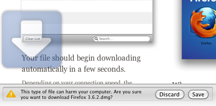
To make sure you don’t miss where the download goes, Chrome seems to follow the age-old philosopy of “if you want people to not miss it, make it big and red.” When you initiate a new download, it displays a falling arrow for approximately a second, to bring your attention to the download bar at the bottom. This does give the impression of “usability testing gone horribly wrong”, where — no matter what the UI designer does — he can’t get people to notice where the downloaded file went, since there’s no dialog box to obstruct the view and call attention to itself. Hence, the only solution is to add an arrow that is so big that you can’t possibly miss it.
To Chrome’s credit, they have iterated quickly on the download UI over the past few versions. Earlier versions had the download bar pinned to the tab it was initiated from — which is pretty much exactly the opposite of what you want, since you’re likely to browse other sites until the download is done. Thankfully, this is now fixed, and the download bar is now global.
A curious side effect of the global download bar UI is that it goes contrary to Chrome’s philosophy of taking up as little space for the browser UI as possible. The download bar steals the equivalent of two status bars of pixels in every tab you’re using unless you dismiss it by closing it:

Another problem, illustrated above, is that it doesn’t really have a solution for overflow. Similar to how Chrome doesn’t yet have a strategy to deal with the case when you have too many tabs (they just get smaller and smaller until they are unusable), the screenshot above actually contains three downloads — the only problem is that download #3 is (presumably) wrapped to an invisible line below the two visible downloads.
Clicking “Show all downloads…” will bring up a download tab, where you can see all the downloads you have made:
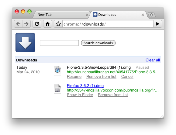
This was an approach originally introduced by Opera, which we’ll talk about next:
Opera
Does quite a few things right (as usual), but have some weird defaults that mar the overall experience. The idea of downloads-window-as-a-tab was first done in Opera, but can still be improved.
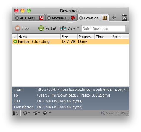
Opera shares most of the same issues as most of the other browsers (asks every time it downloads, opening with non-sensical applications like DiskImageMounter, etc), but overall it is standard fare. One thing to note is the amount of Power User functionality included in the main UI, with things like the “Quick Download” field that will download whatever URL you paste into it directly, its support for downloading all the resources linked from a page, etc. The quick download field is also curiously positioned in exactly the same location as you would expect to find a search/filter bar, and people do try to use it as such — with predictably bad results.
Suggested improvements to the download handling in Firefox
Informed by what other browsers do for downloads, it’s clear that Firefox already does a good job in comparison — but it can also be made a lot better without an ovwerwhelming amount of work. The infrastructure is solid, we have the necessary functionality for most of this already — but the user experience of how it all fits together can be significantly improved.
From the Firefox point of view, we have a list of things we can do to make the user experience of downloading more streamlined and easier on the users. This advice pretty much applies uniformly across all browsers, and as usual — feel free to steal any of these ideas for other browsers. It’s how we make web browsers better.
Replacing the download manager window
The current download manager tries to do a lot in too small a space, so we propose to split the downloads into the following two components:
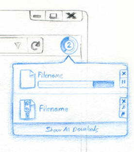
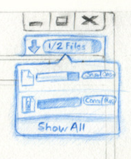
- An easily accessible panel that shows you current state of downloads, your recent downloads, and gives you a good indicator of how far along your download is. Its goal is to surface status, not to perform download management outside of the basics of showing progress & number of files, as well as operations to stop & resume the download. A sketch of our current thinking is shown to the right; it will also light up when starting a download, and possibly add some subtle glow effects to indicate that downloads are in progress, and a more significant event once a download completes.
- A more powerful full-window UI for advanced operations like searching, clearing entries, sorting, and everything else related to Download History. This is also where operations like rename or delete are present. This window should ideally be shown as a tab, and since we have tear-off tabs, you can keep the old-style dedicated download window too, if you prefer that.
You probably caught on to this idea already, but the main point of #2 is that there is no need for a dedicated download manager. The download manager is a listing of history, and should simply be a filter inside the history window that says “show me only files”. Download history is intimately tied to browsing history, and sometimes the additional context is useful when looking for a download you did as part of a browsing task. Being able to show history, and then narrow down to only show files is a natural way of approaching download history.
Other things that would improve the experience:
-
At the end of the download progress bar, a “what happens next?” indicator could be shown — ie. “is saved in the download folder,” “is opened with iTunes,” etc.
- The download history should support simple file system operations (copy/move works, rename), and show where the file is located.
-
If a file is deleted, ghost it in the download log to indicate that the file has gone missing, and make it possible to re-download.
-
Keep track of the new location if file is moved.
- Warn when a download is in progress and you attempt to quit the browser.
- Drag and drop should work from all representations (download panel & download history).
File & application handling
On the infrastructure side, there are a lot of smaller problems that conspire to give the user a less-than-pleasant experience with regards to how files are handled.
Some of the issues that should be fixed:
- Replace “Save” with “Download” in the menus? People do get confused by the difference between Save and Download. Right now, you “Save” a page in Google Docs when you edit, but you can also “Save” the page itself to disk on your computer. How are you supposed to know which one does what? Additionally, the word “download” has entered the mainstream vocabulary; for better or for worse. In the Firefox menu, we currently have a “Save As,” but no “Download” — should we stop using the word “Save” in our UI to make it more consistent? It makes sense, but probably requires some testing to find out whether people are comfortable with it. According to the Test Pilot studies, people use this menu entry quite a bit.
- Don’t ask every time, just do the default action for the common file types. If you ask questions all the time, people stop paying attention. This is the classic UI problem that Windows traditionally had when compared to Mac OS X. If there’s a very logical, straightforward outcome of an action — don’t get in the way of the user. At Mozilla, we jokingly call the “OK” button the “Whatever” button, and there’s even an extension that replaces all “OK/Agree/Yes” buttons with “Whatever” buttons to drive the point home.
- Make the default action simple, make the advanced action powerful. “Open With” (Save As?) should be how you get to adjust location/options. When you choose to special-case something (ie. explicitly choose to download using the right-click menu), we should give you all of the”explicit” options — you might want to rename the file and choose a location when you save it. If you just click the file, we give you the file, no questions asked.
- The browser should be better at remembering locations. It should remember where on the file system you got the last file you uploaded to the current site from, and the other way around — if you ask to download a file from a site, and you’ve done it before, we should remember which folder you saved it to. This has partially landed in the Firefox nightly builds, and when I go back to using a version of Firefox (or other browsers), it makes me a very sad panda when it’s missing. Essential.
- Support Content-MD5 for downloads. File corruption when downloading is becoming increasingly common, and is something we should protect you against. If the server supports it, we should verify the checksum of the file once it has been downloaded, and warn you if the file doesn’t seem like it was transfered intact. There’s already a somewhat related bug for this — but hopefully this can be unblocked by only applying it to downloaded files. We also probably need a new header these days for arbitrary hashes that are not MD5, e.g. Content-Hash: sha256/jh42k5jgh345kj234
- Detect duplicates. We should tell you that you already have a file if we know that you do — and MD5/SHA-1 can really supercharge this. Wouldn’t it be cool if Firefox said “You already downloaded this file, it’s over here, do you really want us to download it again?”
- Improve the Applications preference panel. Firefox already gives you more control than any other browser here, but we should do a better job at pulling the most common applications to the top of the list. Things like how you handle email, web feeds and where you save your downloaded files should be at the top of the list. We should also indicate which entries you have changed, so these are at the top of the list too — and leave the default settings in a state where it’s obvious that you haven’t changed them.
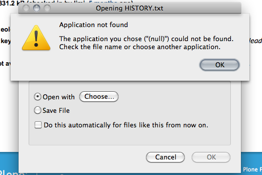
- Clean up file type mappings. We should let the OS handle the MIME types, or clone what it currently does (while blacklisting certain things like EXEs). Some examples where this is currently wrong on my OS X setup:
- Zip files show as “Stuffit Expander,” even though my system has never had (and never will have!) Stuffit Expander installed
- MP3 files say they are going to open with “QuickTime Player,” but actually end up in iTunes instead
- There’s a general mismatch where we seem to assume that if a file is of the “QuickTime Player” type (doh), it will open in that application.
- See also screenshot above. How this is even possible is beyond me. But it should be fixed.
In-content display of content we know how to handle
Firefox has always been about giving control to the user, which is why a dialog like this seems a little out of place:
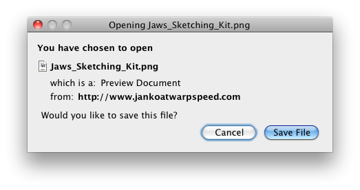
Why can’t I open this file in the browser? Firefox knows how to render a PNG file, why should I have to open the Preview application (oh, and WTF is a “Preview Document”) just to look at the file?
In this case, the web site author or server software set the content-disposition: attachment header, which means that they insist on the image being downloaded. We should of course recognize and respect this, but we can do better, and present a UI that gives you an idea of what you’re about to download, so you can make that decision yourself, and not have it made for you:

The concept is to reframe the download UI to be a bit more like a print preview — you see the content, and get a bar on top with options, a “download preview,” if you will. Here is how it could work:
- If the browser was instructed to pop up a download dialog box, a bar is displayed at the top of the page with commands to save the file, or to send the file to an external application. This also solves the current issue where download dialogs are modal, and will steal focus if you’re in a different tab.
- Similar to the download dialog box, users have the option of setting the default behavior (preview, download, send to external app), but we default to preview.
- We try to increase the set of files that we can preview in the browser to common types like PDF, and perhaps even other document types — this might have security implications, so needs to be done with care.
- Open doc/PDF inline, but give the option to save it to disk — people generally just want to read stuff, not put junk in their download folder.
Additionally, when a plugin is being used to render content in the content area — and the browser did not instruct Firefox to download the file — we should probably display the same bar with command to download or open in an external application. In a lot of cases the user might be viewing a QuickTime movie or listening to an MP3 and they think “how can I download this?” The actual answer is to go to File → Save As, but because that is so rarely done, people usually do not successfully come to that conclusion.
Avoiding the “minefields of the web”
In the event that a download can’t be previewed (the user can’t “stay on the Web”), or the user asked Firefox to remember another behavior for the type of content, like automatic download or automatically sending to another app, we should change the cursor icon to indicate the action when they hover on the link, so that they always know what is going to happen ahead of time.

We’d like to introduce indicators in the cursor/pointer to give you a bit of warning before you click things that aren’t actually web pages. Showing a small envelope icon for mailto:, a small document icon for PDFs (on hover) could be a simple way to indicating that clicking the link will have a somewhat unexpected result.
-
Cursor should show the file type — or protocol in the case of
mailto:— to counter “the land mines of the internet.” The most common are PDF files,mailto:links, iTunes store links. -
Tag cursor icon with file type icon if link is a binary file.
Starting an application like a PDF reader or an email client — or just downloading any file — can take a lot of time, and is often an unexpected effect of clicking a link on a page. We should able to give people a better expectation of what will happen before they do this.
Unifying security questions
On modern versions of Windows and Mac OS X, the “this is a dangerous file from the internet” dialog has been handed off to the OS itself:
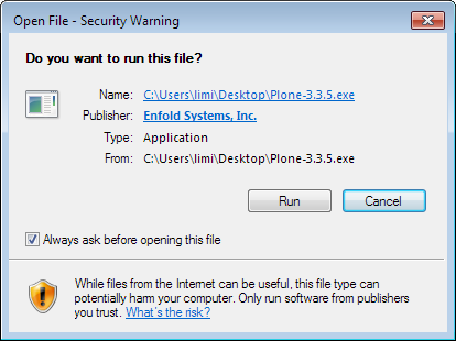
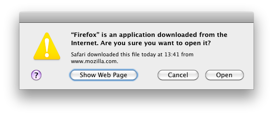
This means that when downloading anything using Firefox, you’ll get two questions about whether you want to open the file on these operating systems. This is unnecessary, and we should avoid asking on the platforms that already have this enabled. It’s not a real security measure in any case — and we should definitely still ask for so-called “drive-by downloads.”
Drive-by downloads
In general, we want to do the right thing when you download files — but there are cases where we should always show the download dialog, the cases known as “drive-by downloads.” In short, these downloads are triggered by events that were not caused by you clicking a link. A common variant is the page that redirects to a downloadable file, so you didn’t actually click the link to get the file.
There are likely to be edge cases that we don’t know about, but we should be able to find a compromise between usability and security — and err on the side of security when it isn’t possible to detect what the obvious thing to do is.
Next steps & feedback
Of course, we want to hear your ideas. Any obvious things that could be improved, any interesting approaches in other browsers or applications? The preferred approach is to put something on your blog (as long as you mention my name on the blog and link to this post, I’ll discover it), or you can give feedback in Mozilla’s dev.usability forum.
Looking forward to hear your thoughts on this, and we hope this document can help make downloading in all web browsers better.
PS: I will update this post with links to bug numbers in the Bugzilla issue tracker once we have decided how the individual issues should be filed, and with a meta-bug that you can subscribe to if you’re interested in them all. I will post a short notice on this site when it’s ready.